We can easily understand all the Products by graphical representation by searching with various dates it shows the Products on respective date.
Go to Generated Reports–>Click on Products Reports.
- Date Range – You can set a date range you would like to know this report to include the information about it.
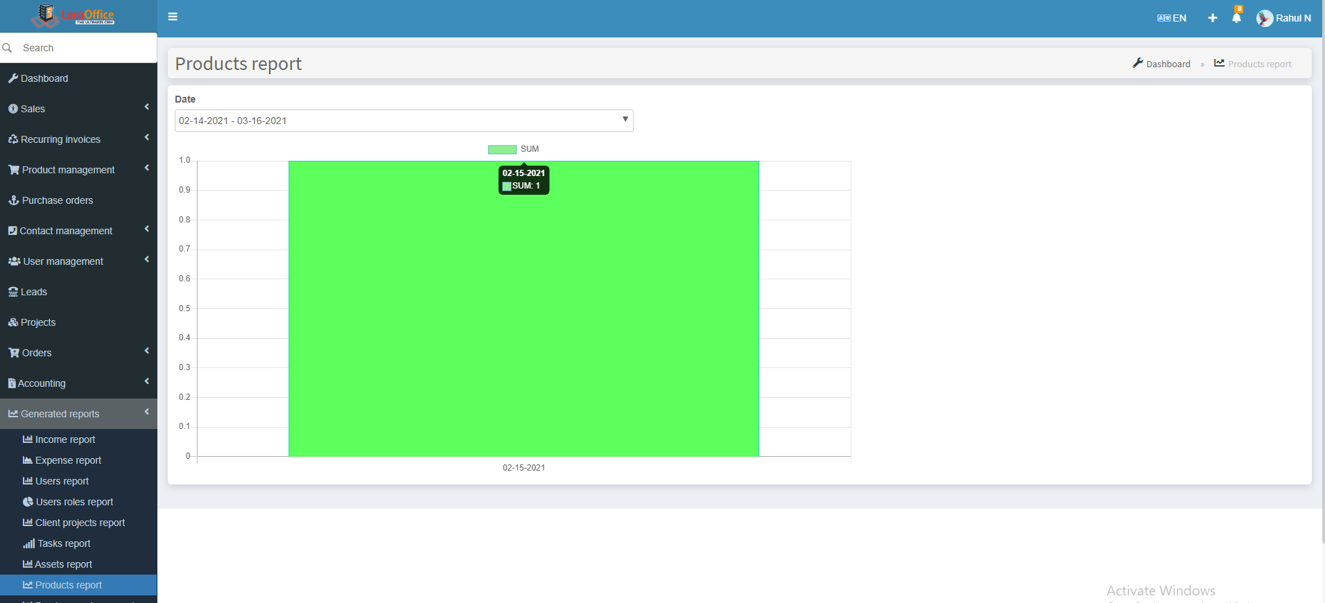 In X-axis, it shows the date fields.
In Y-axis, it shows the number of Products.
 In X-axis, it shows the date fields.
 In X-axis, it shows the date fields.
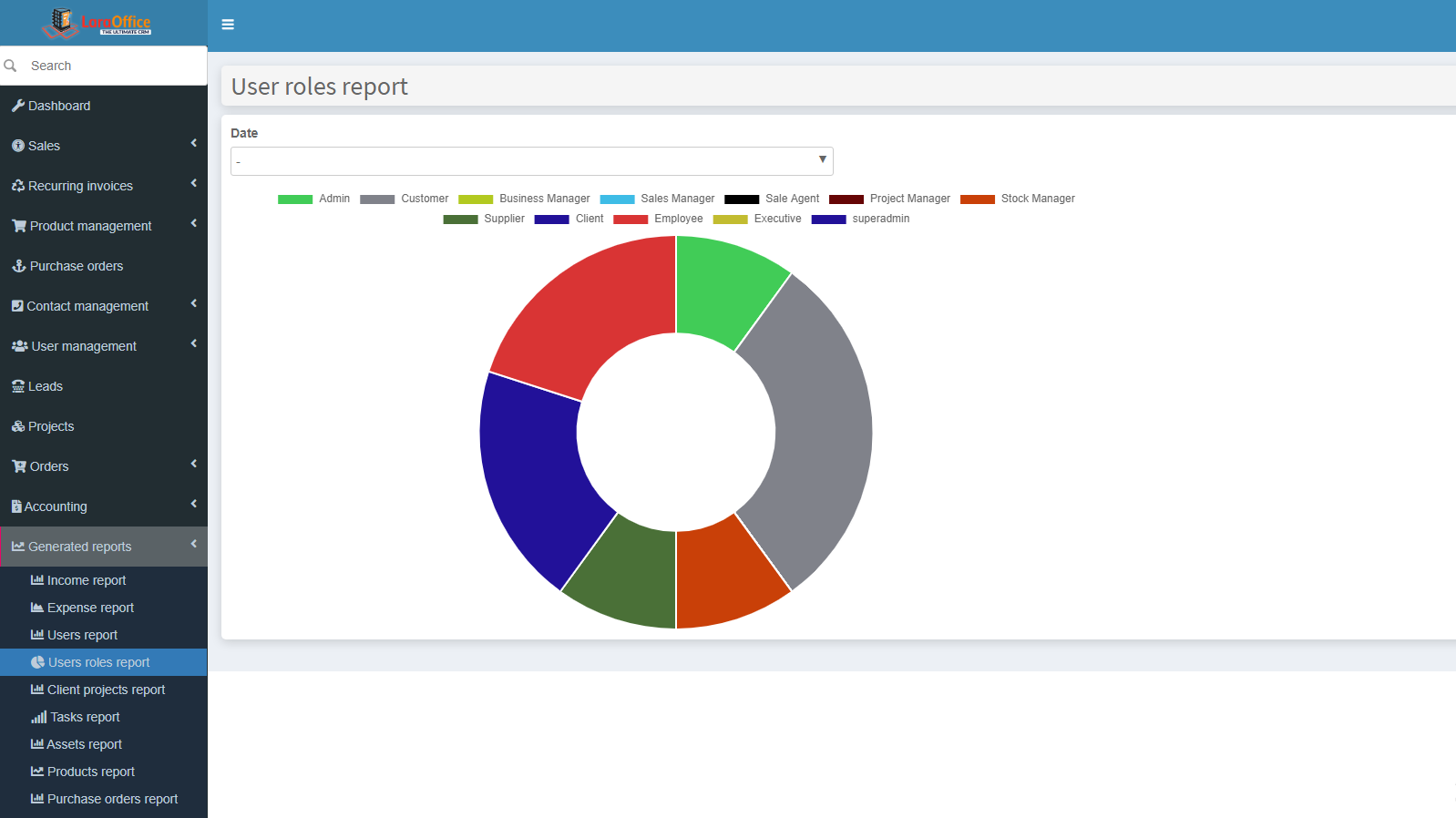 Each and every role has individual color to represent the number of roles easily.
 In X-axis, it shows the date fields.